


CONCEPT ART COLOUR WASH WORKFLOW
31 October, 2023
BY TONIA YAU
You might have heard the terms ‘full render’ and ‘colour wash’ being thrown around in the concept art world, but what’s the difference?
Colour wash is essentially a line drawing with added colour such that the lines are still the main means of holding up overall form. Full render on the other hand has no line work and relies solely on values and lighting to describe changes in form.
Colour wash is useful for production concept art where designs need to be fleshed out for a 3D artist to understand the subject from all angles. This is because line work can showcase the functionality and intricacies of a prop, character, or environment with much more efficiency as opposed to painting a full render. Subtle plane changes, graphics, textures, and logical details of how different parts slot together can also be made more apparent and comprehensible. In this blog I will share my Photoshop colour wash workflow for a standard ¾ view interior cutaway.
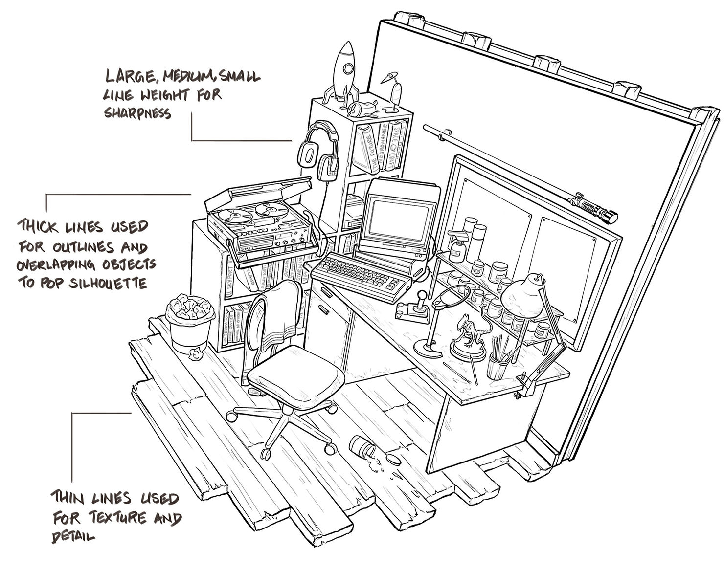
After creating a quick 3D block out using Blender, I export my shot to Photoshop and do my line work on top. 3D models are great tools, but it is important to draw over your model to add details and line weight variation. In most cases merely tracing over 3D models can result in linework that is too simple or rigid. I like to push the line weight contrast between my thick and thin lines so that they shine through even when colour is added.
Once my line layer is done, I will lay down my flat colours underneath. Think about what the ‘local colour’ of the object should be. These hues are often found in the mid tones where the colour is least affected by highlights or shadows. Getting enough material separation creates sharpness and a clearer contrast between objects. If you are doing a medieval tavern and everything seems to be made of wood, try not to use the same ‘brown’ on every surface as it will be harder to tell objects apart. You can have a warmer mahogany wood table on top of some green tinged aged wood planks. Not all wood is chopped from the same tree after all!

Controlling the saturation and value at this point is key, many beginners tend to pick colours that are too saturated to begin with and end up with a painting that is too intense or unrealistic. It is easier to start off with more subdued colours and then bring up the saturation in the end when needed. The colours should also be light enough that the line work is still visible. I will often toggle greyscale to check that my values have good contrast before moving on.
After colours, I will add in textures and graphics. Some textures such as the wooden floor here can also be added in the line work. Though things like the cork board and wallpaper can be added without lines too. Graphic visuals such as the posters or computer screen can really help add to the storytelling as they are icons that the viewer can immediately recognise and relate to a specific subject matter.
Adding light and shadow is next. First, I will identify the direction of my main source of light and paint in my form shadows. For rectilinear objects this will be the planes that face away or are obstructed from the light source. For cylindrical or spherical objects this is the core shadow. Secondly, I will add the ambient occlusion. These are the small areas where objects meet another surface and there is an absence of light.

Highlights and specular really depend on the material of the object. Matte objects will have a duller large area of evenly spread highlight with minimal specularity. Whereas highly reflective objects will have small areas of intense highlights and sharper specular. Specularity can also help show the edge thickness of an object and how bevelled it is. You can take it a step further and add small highlights to your textured lines to create the look of a bumpy texture. Your focal point should have the most detail and sharpness so start here first and slowly transition out to other areas.
Practical scene lights like the desk lamp and computer can be added to create more visual interest and highlight a focal area. These lights are generally for set dressing purposes and don’t impact the overall lighting situation unlike the main light. Lastly, a global gradation is applied to build more depth and draw the eye to the focal point. Near the end I will zoom out and tweak the overall contrast and saturation so that I have a good first read in the focal point.
There you have it! Those are the basic steps to a simple colour wash but is up to you how far you wish to further refine the details. Try this out on a smaller space like this little nook or on a single character before going for huge environments to see how far you can push the finishing level. Have fun and remember to manage your layers!
Related Posts
SPEAK TO AN ADVISOR
Need guidance or course recommendations? Let us help!